Create a new component
Websites have different user needs and the Design System is constantly changing. To meet these user needs you may have to create your own components.
When creating new components it is important to use the inbuilt functionality of the Design System. The components, grid system, variables and functions have been created to help to simplify this process. Using the inbuilt functionality ensures changes to the system and changes you make will naturally flow into your own custom components.
Do the research first
If you are in the process of making a new component make sure it is something your user needs. Often times simple solutions are the most usable.
We like to ask these questions before making new components:
- Is it possible to use an exisiting component?
- Is it possible to meet this user need by customising an existing component?
If you can't use or modify an existing component we ask:
- Is it possible to use components that exist to make this ( grid, buttons, responsive-media, body )?
- Can we build this component in a way that other products can benefit from it in the future?
- Is there research or discussion about similar patterns on the community?
- What functions and variables in core can I use in this component?
Lets create a component
We are going to create a card component. So lets answer the questions above.
Is it possible to use an exisiting component?
We could use callout; however, callout should be used for bringing attention to a piece of content. We need a solution that groups content together and the content inside it can be flexible.
Is it possible to meet this user need by customising an existing component?
We could probably customise the callout component to meet this user need. However, it feels a bit confusing, cards are used for grouping and callouts are used for grouping text and highlighting it to a user. In this situation we will create the component but let the community know that card and callout are very similar but meet different user needs.
Is it possible to use components that exist to make this?
For now we will be keeping it simple and not using any components. However, we will use the functionality from core and in the future we can add the headings for the card titles as a dependency.
s
Can we build this component in a way that other products can benefit from it in the future?
Yes, we will be focusing on keeping this simple so we can share it with others.
Is there research or discussion about similar patterns on the community
Yes, there is a great discussion on cards. We will use this as a basis for the work that is being done.
What functions and variables in core can I use in this component?
We can use the functions to keep our components spacing consistent:
AU-spacewe can use for our padding inside the cardAU-fontgridwe can use for our typography inside the card
We can use the following variables to keep the components appearance consistent:
$AU-color… variables for the colors$AU-border-radiusfor the round corners
We will need to create a variable for the shadow around the card as this currently doesn't exist.
Building a custom component
Before you start creating components it is recommeneded to understand how to use BEM (Block Element Modifier). BEM allows our components styling to stay reusable and modular.
To start we need to create a basic card with some text inside of it. This will be the foundation of our component and we will modify it in the future.
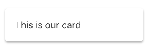
To do this we will create a simple HTML snippet for a card.
<div class="card">
  <p>This is our card</p>
</div>
We now create our styles for the card.
$boxshadow: 0 2px 4px rgba( 0, 0, 0, 0.3 ) !default;

.card {
  @include AU-space( padding, 1unit );    // Padding inside the card
  background-color: $AU-color-background; // The white background color
  color: $AU-color-foreground-text;       // The grey text color
  border-radius: $AU-border-radius;       // The border radius
  box-shadow: $boxshadow;                 // The box shadow
}
Understanding the colour system and the spacing functions will allow your new components to get the most out of the Design System. The core component provides functions and variables to make creating components easier. Core will not have everything you need and you will need to create your own variables for example $boxshadow seen above.
We recommend using autoprefixer to automatically add vendor prefixes.
Modifying our component
As the component evolves and has more uses throughout the system you may wish to modify it. Modifying a component is when you want to use the existing styles but change some of them. We often do this when creating a dark variation of components.
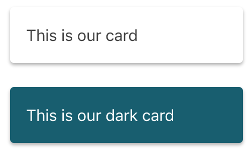
Lets create a dark variation of the card component. For the modifier class we start with the component then add -- with the modifier name ( dark ) at the end.
<div class="card">
  <p>This is our card</p>
</div>

<div class="card card--dark">
  <p>This is our dark card</p>
</div>
To change the card we need to override the styles below where we created the original. We can also be more specific by adding the original class name to the front.
$boxshadow: 0 2px 4px rgba( 0, 0, 0, 0.3 ) !default;

.card {
  @include AU-space( padding, 1unit );    // Padding inside the card
  background-color: $AU-color-background; // The white background color
  color: $AU-color-foreground-text;       // The grey text color
  border-radius: $AU-border-radius;       // The border radius
  box-shadow: $boxshadow;                 // The box shadow
}

.card.card--dark {
  background-color: $AU-colordark-background; // The dark green background color
  color: $AU-colordark-foreground-text;       // The white text
}
Adding child element
Inside our original component we may wish to add a child element. A child element should only be used inside the original component, otherwise you may consider using existing components or creating a new one.
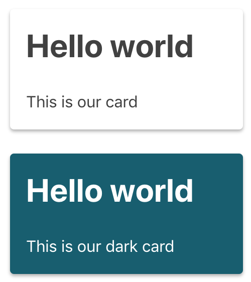
To create a child element we can add some HTML for a title inside the card. For the title element class we start with the parent component then add __ with the child element name ( title ) at the end.
<div class="card">
  <h2 class="card__title">Hello world</h2>
  <p>This is our card</p>
</div>

<div class="card card--dark">
  <h2 class="card__title">Hello world</h2>
  <p>This is our dark card</p>
</div>
We can then add the styles to our components SASS.
$boxshadow: 0 2px 4px rgba( 0, 0, 0, 0.3 ) !default;

.card {
  @include AU-space( padding, 1unit );
  background-color: $AU-color-background;
  color: $AU-color-foreground-text;
  border-radius: $AU-border-radius;
  box-shadow: $boxshadow;
}

.card.card--dark {
  background-color: $AU-colordark-background;
  color: $AU-colordark-foreground-text;
}

.card__title {
  @include AU-fontgrid( md );
}
Now that our card is complete we can share back our code with the community. Keeping our components simple means they are more usable for other developers and designers.