Use the font size and space functions
We've introduced the AU-space and AU-fontgrid functions to allow designers and developers to speak a common language. These functions help ensure that elements and typography snap to a predefined 4-pixel-grid, which is set by the $AU-unit variable.
AU Space function
Developers can use the function AU-space for consistent spacing across elements on all browsers. This is done with a new unit we created, called unit, to allow designers and developers to be able to keep consistency.
1unit is the equivalent of 1rem, which by default is 16px.
The AU-space function accepts three parameters:
- The property you wish to add space to,
- The values of the spacing size, and
- An Internet Explorer 8 pixel fallback.
The output is the CSS property with a rem spacing applied to it and a pixel fallback for Internet Explorer 8 (if the pixel fallback parameter is not selected as false).
Property
The CSS property to apply the spacing. For example margin, padding, margin-top.
Values
These are the values that are applied to the above CSS property. It is recommended to use unit however it is not a requirement. Other units you may use are px, %, rem or em.
Pixel Fallback
pixelfallback is a boolean that toggles support for a pixel fallback for Internet Explorer 8 users. By default it is set to true. This can be changed on a per-use basis, by passing false in the third parameter of the AU-space function. Or it can be changed globally, by setting the $AU-pixel-fallback variable to false.
Example of AU-space function in use
The following SASS code:
@import "auds.scss";

header {
  @include AU-space( padding, 1unit 0 0 40% )
}
will render the following CSS:
header {
  padding: 16px 0 0 40%;
  padding: 1rem 0 0 40%;
}
You might notice that the padding is repeated twice, in both the rem and px units. The reason for this is that Internet Explorer 8, by default, does not support the rem unit.
The rem unit is important for accessibility and scalability of user interfaces. It is based on the browser defined font-size, which is normally set at 16px. If we set the font-size of a <h1> element to 32px on our website instead of using rem, it will always be of size 32px. In the case that a user has a vision impairment and wants to increase the default font-size of the browser from 16px to 20px, the <h1> would still be rendered as 32px on the web page.
If we set the font-size for the <h1> to 2rem and the same user now adjusts their browser font size from 16px to 20px, the <h1> font-size will scale accordingly from 32px to 40px (2 * 20px). This is because the rem unit multiplies the browser font size.
Font Size Function
The AU-fontgrid function allows developers and designers to scale their typography while making sure they snap to a 4 pixel grid as defined by the $AU-unit variable.
For consistency, we've defined a typography scale in the core module. The AU-fontgrid function accepts two parameters; a font-size and a line height. The return of this function is a font-size and line-height combination that snaps to the grid, with the font-size having a pixel fallback for Internet Explorer 8.
Font Size
One of seven options can be selected for the font size: xs, sm, md, lg, xl, xxl or xxl. The option md corresponds to a font-size of 20px, for example. See below for the full list of options and their corresponding sizes.
$AU-fontsize-map: (
    xs:   14,
    sm:   16,
    md:   20,
    lg:   24,
    xl:   32,
    xxl:  40,
    xxxl: 48
) !default;
The font sizes are in pixels, though we haven't added a px unit. This is because the AU-fontgrid function uses the unit-less font-sizes to perform calculations to adjust line height.
Line Height
The line-height CSS property defines the vertical spacing above and below an element. The line-height can be set using a unitless number, or by using either of px, rem, em or %. In the AU-fontgrid function, we are using unitless numbers to set the line-height. Mozilla have a great article that explains why numbers are preferred over length to set the line-height.
The line-height parameter accepts one option, from a range of three: nospace, heading or default.
$AU-lineheight-map: (
    nospace: 1,
    heading: 1.25,
    default: 1.5
) !default;
When the line-height is a number without a unit, it is multiplied by the elements own font-size, to produce the height of the element. If we have a font-size of 16px (sm) and a line-height of 1.25 (heading) on an element, the height of that element would be 16px * 1.25 = 20px. Perfect, this snaps to our 4 pixel grid.
Making sure typography snaps to a grid
A problem occurs when we increase the font-size from 16px to 40px, for example. The new element height would be 40px * 1.25 = 50px. This does not snap to our 4 pixel grid, since 50 is not divisible by 4.
The AU-fontgrid function solves this problem by performing calculations which adjust the line-height slightly to ensure the typography element snaps to a 4 pixel grid.
Example of the AU-fontgrid function in use
Below, the xxl corresponds to a font-size of 40px, heading corresponds to line-height of 1.25. The following SASS code:
@import "auds.scss";

p {
  @include AU-fontgrid( xxl, heading );
}
renders the following CSS (notice how the line height is adjusted from 1.25 to 1.3):
p {
  font-size: 40px;
  font-size: 2.5rem;
  line-height: 1.3;
}
and in the browser:
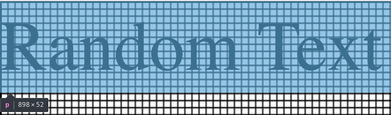
This gives a total element height of 40px * 1.3 = 52px.
Note 52 is divisible by the
$AU-unit, which by default is 4
Altering the grid
The grid-size is customisable by altering the $AU-unit variable. If for example this value is changed to 7, the new typography will snap to a 7 pixel grid.
//change the default grid size
$AU-unit: 7;

@import "auds.scss";

p {
  @include AU-fontgrid( xxl, heading );
}
renders the following CSS:
p {
  font-size: 40px;
  font-size: 2.5rem;
  line-height: 1.225;
}
And in the browser:
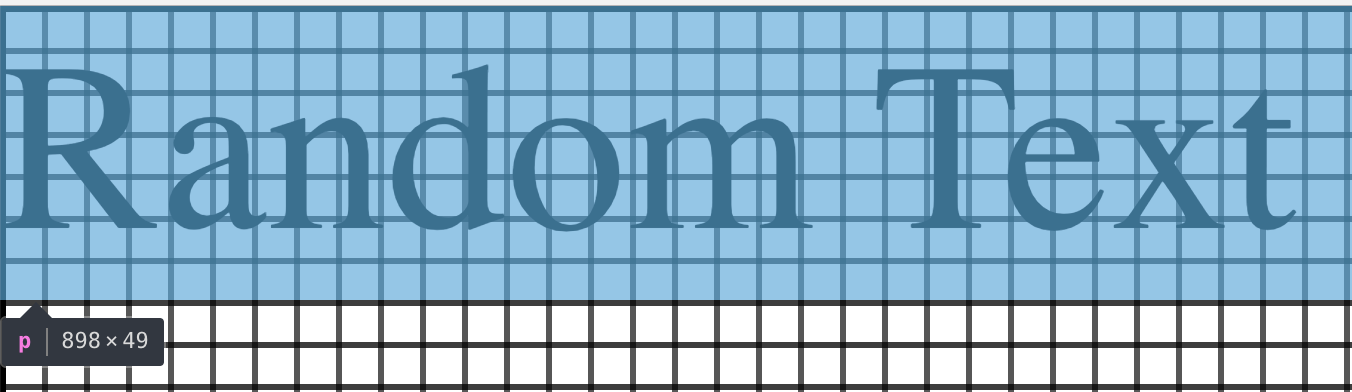
This gives a total element height of 40px * 1.225 = 49px.
Note 49 is divisible by the
$AU-unit, which we have changed to 7
Use of system fonts may cause changes in the layout of the page across operating systems. Using these functions ensures that the text will still align to a grid.